Project Overview
HC Health pharmacy is a solution for preventing the waste of medicines. It is an intelligent trading platform for pharmacies around the globe to sell and buy medicines. The primary motive for founding pharmacy was to preserve the environment. Chemicals, plastics, and other materials created due to the decomposition of medicines are released into the oceans or dumped into the ground. By using UCHealth, pharmacies can manage and track medicine and either manually or automatically trade it.
I joined as a Product Designer to build the first MVP(Minimum Viable Product).
Problem
Each year, millions of medicines are thrown away in pharmacies, causing millions of dollars in losses, We looked for the cause and how we could prevent it.
In the United States alone, about $ 390 million worth of drugs were discarded in 2017. By 2026, due to diseases, this figure will reach $ 1.5 billion. These drugs are harmful to the environment and are discarded for a variety of reasons.
Challenge
Our challenge was to design a system that would help increase productivity for pharmacy technicians. They believed that current systems with the old design would be wasting enough time; otherwise, using the system would be counterproductive, to using traditional methods.
Goals
The goal was to design a platform that would prevent the disposal of medicines.
My Role, Team & Duration
My Role, UX Designer.
Duration, 6 Months
Team, Junior Product Designer (Visual Designer) + UX Researcher
My approach as a designer was to collaborate with stakeholders and other team members to find the best solution.
Design Process

Understanding the users
I interviewed 5 pharmacists and the head of the pharmacy about the reason for throwing away the drugs.
After analyzing the interview data, I came to the following conclusions:
– Expiration of the medicine
– No need for customers in that area
– Lack of knowledge about medicines that are expiring
– Lack of system for knowing the expiration date and receiving the list of expiring drugs
– Restricted pharmacy sales to a specific region
– Order more than needed because they were in high demand in previous months
– They expected to be prevented from constantly moving back and forth between the computer and the inventory shelves
– Maybe other pharmacies need those medicines.
Interview Pain Points
Based on the interview results, we concluded that pharmacies need a system that, along with the primary pharmacy management system, helps them know the expiration date of the drug also be able to communicate & exchange with other pharmacies and, if necessary, medicines. Send to other pharmacies before expiration to prevent financial loss.
Current systems are a barrier to further productivity because they are only desktops, so we must constantly move between the shelves and the desktop system.
– A Pharmacy Technician
Persona

Solution
A platform that meets the following three basic needs:
1. Better information on the stock and status of medicines
2. A marketplace for buying and selling medicines between pharmacies
3. A system for scanning medicines by LOT number and expiration date and entering the inventory
Also, connect to the current pharmacy system.
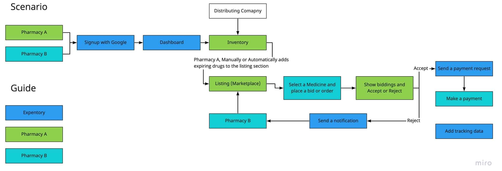
How to system works?
Ideation
Given sufficient information about the needs of users and interview results and features of existing systems, we decided to design a mobile app and connect the platform to the current pharmacy system.
This app with the following features can increase awareness and reduce harm in pharmacies:
– Management of invoices and orders: to quickly scan drugs and record drug information
– Inventory Management: To view the list of drugs and display expiring drugs
– List management: To display the drugs that are on the sales list
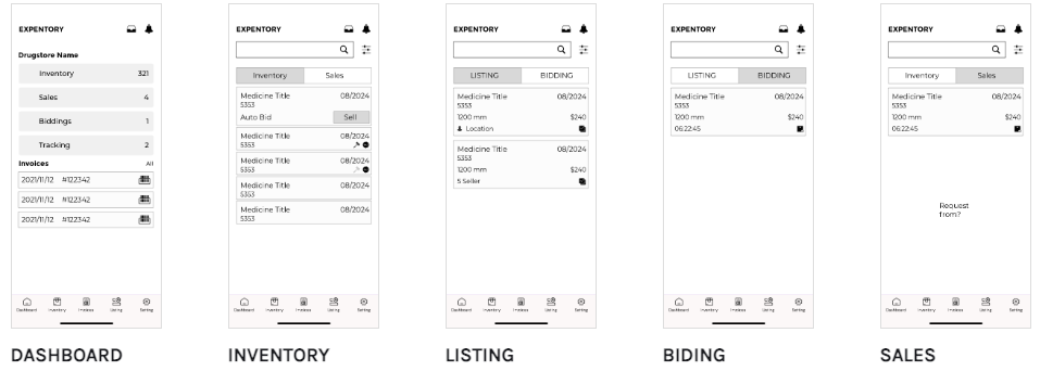
I sketched the following ideas, and then I talked about them with stakeholders and other business team members.

Wireframes
Final Prototype & Flows
The final design included the following states and functionality.
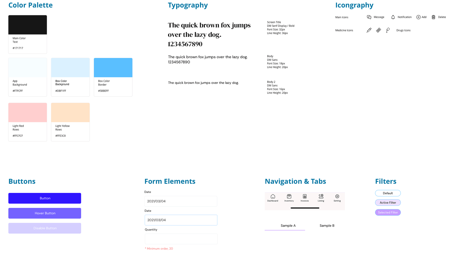
I designed a polished and minimal look that represented the initial design ideas about freshness and created an interactive prototype to map users’ main interactions on the app. In the design process, these interactions were iterated and revised based on feedback from potential users.
The final app prototype can be divided into these four flows:
1. Signup / Login by pharmacy
2. Order invoice management
3. Inventory
4. Bidding payment
UI Guideline
Task Flow: Inventory
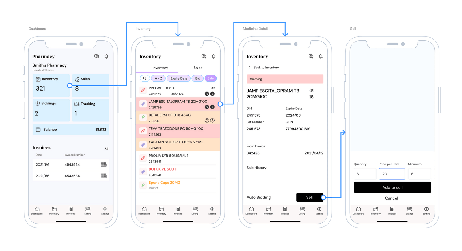
In the dashboard, the user has access to the list of drugs, drug requests from other pharmacies, the status of packages sent and the latest invoices.
In the inventory section, the pharmacy can sort the drugs by expiration date (this date and color can be changed from the settings section) and transfer the expiring drugs to the list so that other pharmacies can send an offer if needed and with approval. The pharmacy sends the medicine.
Task Flow: Order Check
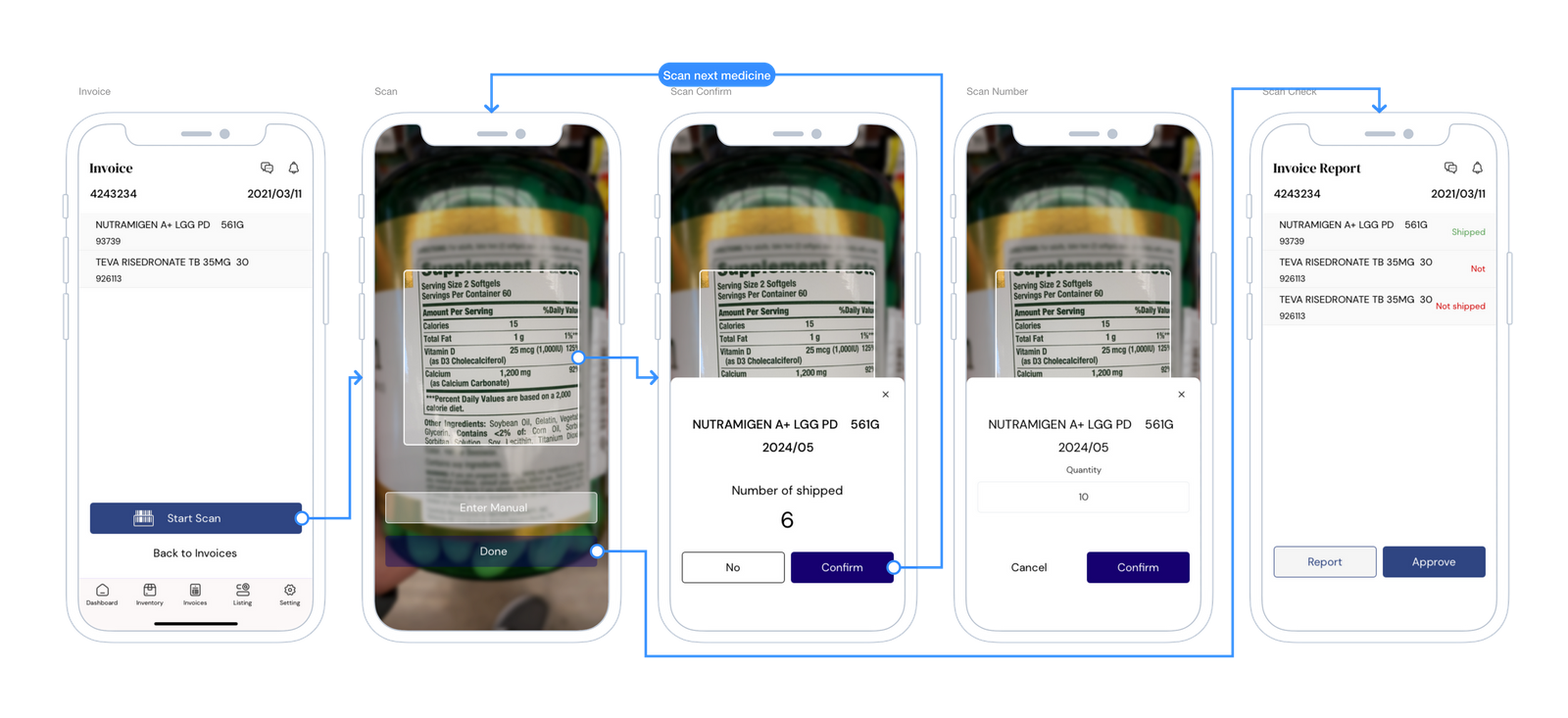
In this process, the pharmacy technician views the list of invoices in the app, then selects each invoice and starts scanning. Each invoice is on a box where the technician scans the medicine box and then the number that should be delivered to the pharmacy. Is displayed, confirms if the number was equal, otherwise enters the number of drugs manually and scans the next drug.
At the end, a list of discrepancies is displayed, which confirms the list and sends a report to the pharmacy manager or distributing company.
Prototype
https://invis.io/SBRYX3GX3AFhttps://invis.io/SBRYX3GX3AF
User Testing
To test the app prototype, visual design and interactions, I formed a usability testing session with a few pharmacy owner and technicians. I asked them for their feedback on the functionality and flows. While most users liked the overall prototype, they wanted to see more features on the app, such as a screen where one could view invoices, scanning medicines and add a medicine to listing for bidding by other pharmacies where they can find for their inventory items.
Usability Test Result

Review
After usability testing we found some problem for scan process, and revise user flow again.
Deliverables
An interactive prototype with Marvel.
Hand-off for developers.
User flow.
Outcomes
– Scanning time for one-factor drugs and entering them into pharmacy inventory was halved.
– The technicians sent more detailed reports to the pharmacy owner about the status of the expiring drugs so that they could decide whether to sell the drugs.
– An average annual loss of $40,000 per pharmacy will be avoided.
– Interaction with other pharmacies improved.
